Wednesday 23 October 2013

OUGD504 - creative suite workshop 1

Illustrator

In this session we will be focusing on using the swatch pallet in illustrator, its main advantage being you can create and save your own swatches. This will give you consistency throughout your work, thats easy to access. 


This is a good way to set up your swatch pallet by deleting all the un-used colours


Then you can make the swatches easier to navigate by putting it in a large list view


To create a new swatch you just go onto the menu or use the bottom right button, the standard mode should be CMYK, you can use any way to make a colour if you want to use the the colour picker you can create a new swatch in the colour that your happy with 


If you tick the global box it will change anything over the whole document under that colour, 

Spot colour

Spot colour is a solid colour, that is printed not using CMYK, its a colour that has been printed using its own colour. using spot colours can make printing significantly cheaper, the more inks you use to higher the cost. It can also make a print more expensive if your already using CMYK.

They allow you consistency in reproduction within your print, a client may often give you a spot colour to work with as what your designing for may need to be reproduced in many different places.

fluorescent and metallic colours are specialised inks this gives you other options when printing with spot colours.


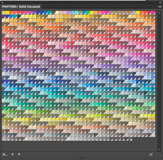
If you open the colour swatch library you can select the different pantone books and others.


These are the pantone solid colour uncoated swatches
these colours only really apply when your commercially printing if your using the computers in the print room the colours will be accurately produced but may not look exactly the same. When using a spot colour you shouldn't change the name because this is how a printer will recognise the code for the colour.


When saving your swatches you should save as AI so its ready for illustrator, to open it you just need to go to the open swatch pallet option then click on the saved file. You can also save a swatch library as ASE which means you can use them with other programmes within adobe software. 


Tuesday 22 October 2013

OUGD 504 - Dreamweaver workshop

explore websites, do some research
the Session we had today was focusing on website standards and limitation  

Web safe colours
original computers could only support, maximum 256 on their 8-bit monitors, a list of 216 web safe colours were identified.

these colours were reproduced across the web using html, specifically a six or three digit hexadecimal code.

Red
#FF0000
#FF0

White 
#FFFFFF
#FFF

Black 
#000000
#000

web safe colours

This wider range of colours can be reproduced by using CSS rather than HTML, these colours are identified by using the same principals as illustrator or photoshop, by specifying the percentage of 255 per RGB.
100% red would be rgb(255, 0. 0)

Web safe fonts

Computers must use a standard font to be able to be displayed consistently.
Font families are chosen with fallback options to ensure maximum compatibility between browsers and systems, for example if the browser does not support your specific font it will try the next font listed.

Some common font families 
serif fonts - 
Georgia, serif
"palatino linotype", "book antiqua", Palention, serif

if the font has a space in its name you have to put speech marks round it so the computer can distinguish between the names of the fonts.

some web safe font families - 
sans-serif fonts

Arial, Helvetica Sans-serif 
Tahoma, Geneva, Sans-serif
"Trebuchet MS", Helvetica, Sans-serif
Verdana, Geneva, Sans-serif

CSS font face

The CSS compatible @font-face allows you to install fonts to a website, meaning the font choice remains consistent regardless of the browser or system.

however using a font-face breaches licensing and copyright laws related to specific font foundries.

there are many free font websites that include free licensing usage for @font-face kits including fontsquirrel.com.

Size, dimention, pixel resolution

640 x 480
800 x 600
1024 x 768
1920 x 1080
2880 x 1800 (220ppi)

File formats

PNG
GIF
PDF
JPEG
-
72ppi
RGB
-
lossy 
compressed 
these are all compressed so they can be as small as possible, there is an art to file compression so you can display something that is small in size but still with good quality.

We then started to look use dreamweaver by opening a new blank document, in this session we are going to learn to do some basic coding


this is the blank document 


and this is the code to create just a blank document

Line one isn't completely necessary to make a site work, you can delete it to create a website in its barest form, 
you can also delete the second line adress so you just left with <html>
a target with a / in front of it means close without it means open, eg <html> </html> you need to have an open and a close to make a site work.

line 3 its open <head> then on line six is </head>
the head relates to functionality, this is where it is always contained. in between these tabs is a meta tab which is used for search engine optimisation, to optimise a search you add in key words, this tab its where you would place the words. Not needed for a website to work. Meta tabs dont need close tabs. 

The title is another thing that can increase search engine optimisation, it isnt included in the actual design but will appear in the site adress. its also appears in a tab and is given the name a favicon. 

open and close body (<body>) anything that is part of the design needs to go after this and before the close body tab.

File management is important because if all your files arnt in the same place then the website wont work. everything your working on must be contained in one folder, its a similar system to indesign but to a more extreame level. When you first start a website you must start as how you mean to go on, to keep all your files you must create a root folder. 
for uni computers, save onto your hard drive, never use spaces or uppercase.
I have created a root folder on my HD and within this I have made a sub folder which I have named images, this is where any media goes. All the html and css files go loose inside the root folder. 


To get this up you click on the site option on the top bar 


You find your root file on you user HD then click choose 


This will then appear at the bottom right hand corner of your screen to show you where all your files are being saved. 

When saving your work you must call your first page, the home page - index, this is a globally recognised term for the first page any other page can be called whatever you want.\


This is how you preview your work live on a website page. The best way to work is to have your browsers open and every time you make a change you should preview it each time, so that if something isnt working you know whats gone wrong.

Monday 21 October 2013

OUGD 504 - Design Production: Concept Task

We were put in groups of about 6 people and told we were going to be given 3 different words and a place, for example the choice of places were between a bar, a hotel or a restaurant. the words that we had to choose out of a pot could be relating to anything. The words we chose were pipe abacus and ball. Out of the 3 words we had to select one to focus our concept on to make it relate to the place we were given, in our group we picked hotel. The word we eventually chose was abacus, after brainstorming all the words to think of the best possibilities relating to a hotel we found that abacus had the best potential.


Our initial ideas consisted of:

Having slides for children and adults to move around the hotel
Having a hotel for blind people and making it a sensory experience with brail
Making it really chic and trendy in the centre of the city
We considered the fact that the plural of Abacus is Abaci - suggested name?
The idea of incorporating geometric design within the hotel to represent the balls
Perhaps sectioning off the hotel to incorporate the history of Abacus - countries?

After choosing our word we did some more research into the abacus and its origin, we wanted to establish a theme throughout the hotel that didn't necessarily directly relate to an abacus but  contained aspects relating to it. 
As a group we liked the fact an abacus was used throughout the world in many different cultures and countries and that it had exactly the same meaning. It was a universally known object that didn't hold any language boundaries. We traced its origin and found that there was no single know origin it was basically just the most logical way to count back in the day. We liked the simplicity of the design and we also explored the possibility of relating our abacus themed hotel to accommodate blind people as using an abacus can be a purely sensory experience, you wouldn't necessarily need to see to use one.

Once we had come up with our words to use, we then applied them to possible concept ideas. We had so many different ideas, considering audience especially and whether the concept should be focusing on a younger audience or adults, seeing as we are designing a hotel.

after exploring many different possibilities we started to come up with a theme for our hotel, we eventually chose a nature inspired theme which stemmed from the natural, simplistic back to basic nature of the abacus. We did some initial research into hotels in forests and 'glamping', focusing on the look to them and the sort of things they offer. Initially we liked the idea of these pod like tents you can buy that are inflated for you to stay in, the idea behind the tents is that they are fully transparent so that you can be more connected to nature. We felt using these bubble tents in our concept would tie nicely in with the abacus theme, as the spherical shape echoed the design of the counting balls used on the abacus. We thought of how we can arrange the tents and we felt setting them into the ground might work well.


Building on this idea we explored other possibilities for the placement of the bubble tents, it was suggested that they could be up in trees after we did some research into the adventure activities course called go ape. This is an adventure course that you make your way around through and down zip wires. We like the idea of having rooms suspended in trees because it was something unique that ties in well with the abacus theme.


Other research for the concept consisted at looking at the Edan project which was a definite inspiration for our hotel, It incorporates the eco friendly theme and a similar structural idea that we were looking for.


We had to take into account of some aspects of our hotel like for example, the target audience, the location (either had to be in or around leeds), the facilities and the branding like logo designs and the use of appropriate colours ect... Not to mention the actual design of the hotel.


We all assigned jobs to each other for specific parts of the hotel after we had sorted some of the basic ideas that we were going to use for the concept. I started to draw up some ideas for the look of the hotel to give something visual to show when we presented our concept in the next session. I then moved on to designing a logo for the hotel, I started with a sheet of ideas using the circular shape of the sleeping pods and also the abacus beads as a basis for the design. I wanted the design to be simple and clean but also reflect what our hotel concept is about.


After discussing within the group we came to a conclusion to use the logo as seen below, I designed it with many different aspects in mind. The lines in the logo represent the tree and also the shape of a leaf to relate it back to nature, the ball represents the pod you sleep in but it can also represent the sun to re enforce the nature side of the branding.


I also had a go at creating a type face to couple with the logo image, which in the end I didn't end up using because I felt a digitised typeface work a lot better.


In the end we couldn't decide on a logo so we presented both, im quite happy with the way they turned out I feel the concept was represented well within the logo.

Other areas that we went into when discussing our concept hotel as a whole was the colour scheme, this at first doesn't seem particularly important but it one of the main things people will see when you see the hotel. In this instance the colour would have to be right because the hotel is trying to blend into nature and if there are colours that done fit or are out of place then it will become immediately noticeable. As a group we selected quite a neutral and soft colour pallet, I was chosen to help blend the hotel into its natural surroundings. 


Finally we had to present our ideas to the rest of the class Laura in our group had prepared the slides so we could talk about our concept.


Tuesday 8 October 2013

OUGD 504 - Design for print

In todays session we looked at design for print as we were told to do in a previous blog post. As a group we went through 6 different categories relating to print 

Format
Colour 
Production 
Process 
Finishing 
Stock


As a group we went through each category and discussed which each meant and what would apply to each one.
After this we went round as a class a briefly summed up each category, 

Format - scale, size - working within that 
Colour - colour modes, hues, chromatic values and tones
Production - the actual making of it
Process - method of doing it 
Finishing - production and process 
Stock - substrates for printing consideration - eg. costs