Saturday 24 May 2014

OUGD 505 - Studio brief 2 - Branding and way finding research

When reseaching for this brief I looked quite extensively at the branding done for london 2012 and this years Sochi olympics


Each as you would expect had a very strong identity, for the london olympics for better or for worse it will be remembered due to the branding. people weren't happy with the logo originally but as something that works consistently across a range I feel that as a whole the london olympic branding works really well. and I dont mind it too much.
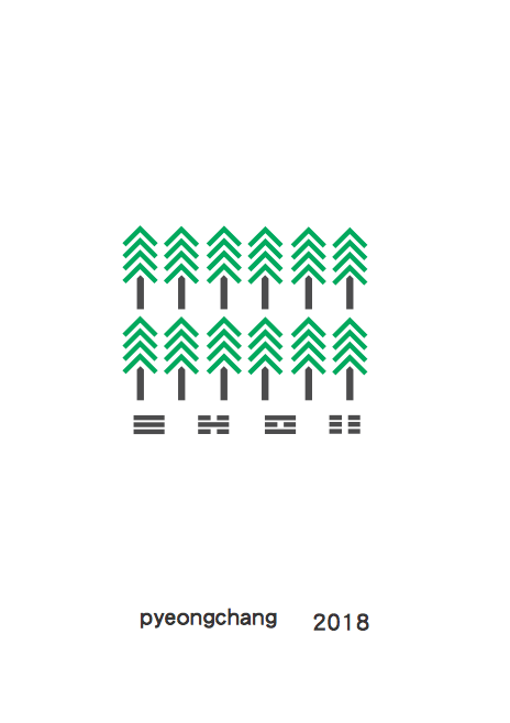
Sochi went for a very colourful pattern based approach that took influence from they're culture. I feel looking back on my projects this is something that I should have looked into further. I should have made some branding that really related back to the south Korean culture.
Across my range of branding I made it consistant and understandable. one of the main physical pieces of branding I produced were the tickets for the games.

Friday 23 May 2014

OUGD 505 - studio brief 2 - Branding and way finding

Although it took some thought on what I was going to produce as a response to the second part of the studio brief it was quite obvious when I focused on what I was doing. I decided I was going to re-brand/brand the next winter olympics in Pyeongchang in south Korea in 2018. Some branding already exists for this as preparations have already started but they are very minimal so it gave me an excellent chance to start from pretty much a blank canvas. I wanted to create the branding for the winter olympics in a similar style to how a produced the book for studio brief 1. 

The things I felt I could rebrand were:
Logo
Poster - A main poster and several individual event posters
Medals 
Kit 
Stadiums
Olympic park layout
Tickets
Merchandise
Signs/ banners - for wayfinding  
Website 
App
Lanyard - that could contain a map, event times and a calendar

I made this list so I could choose things that I felt were most important. Some of the things like staium and olympic park design would be something I would design if I got everything else done. The main branding I wanted to achieve were
Logo 
Posters
tickets
merchandise 
website 
app
lanyard

I felt by doing all of these then I would have a broad range of branding as a basis for the project. For the way finding aspect of the brief I chose to create some signage and banners for the event the sort of stuff you would see around an olympic park.

I first started by designing a logo. one for the event already exists but it isnt particularly creative or representative of the host nation. 


This was the final logo I ended up deciding on, I liked the use of the mountain shape to reflect the ying yang symbol South Korea have in the original flag. I also went against the original gradient or just block colour and replaced it with the 5 colours used in the olympic rings. It took quite a few variations to get this right but I was happy with the final logo design. Once I had the logo I could start implementing it across a whole range of branding. For this brief this was something I needed to get right so it would work across a range. 


I designed the posters in a similar style I designed my book in. I felt the swiss modernist style worked well for this particular style of branding. I took inspiration from this type of design so that the two studio briefs would work well together. I didn't want to just create a completely different style because I felt the two projects wouldn't have any cohesion. 

For the poster designs I did quite a few variations because I felt some elements were working and some weren't. 


These were some of the original posters I created, I wanted to include the South Korean type in the posters because I felt it reflected the olympic games well. The type on the flag that I used in the posters has many different meanings. individually they represent north east south and west, they also represent the four seasons and also represents the four elements. I thought this was an important part of the poster design because it reflected South Korea in the rawest sense. 


For the alternative posters I wanted to create images for each individual main event. I started by creating shapes that represented the sport. I quite liked the idea of using just the most basic items you would need to participate in the sport. I felt though  with some events this really wasn't possible to do. I also tired to represent the events with the olympic colours. I had the same problem with this approach where some events this wasn't applicable. I developed this further and looked into the amount of athletes that would compete in each event and looked to show this with a series of symbols. 


This was what I finally chose to do for the poster series. I chose a typographical style for the event posters because I felt this could be the most transferable and that it could work well with every event. The main poster I produced was an information based one which displayed the logo and when the winter olympics were taking place.