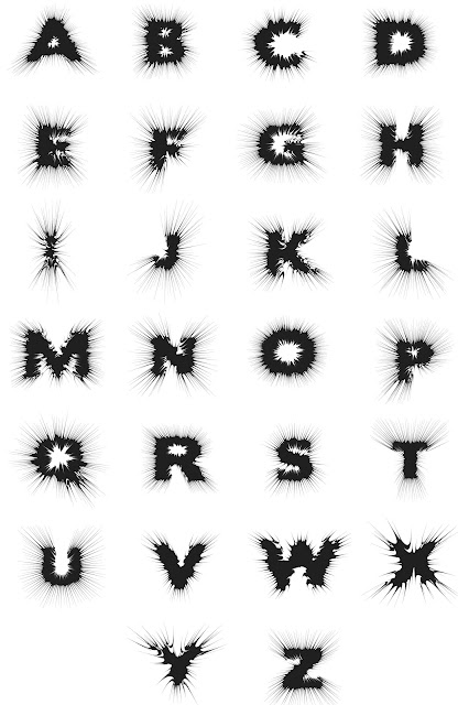
The task was to take your chosen letter and produce an alphabet using the same techniques you used to create your original letter.
I chose a combination of the two effects I created from the original 10 letters to make my final alphabet. I liked the way they these 2 letters looked, but I felt that they didn't represent boom well enough so I used the different effects to make a slightly different looking letter form.
I used a pretty simple technique to achieve my 'boom' effect, it did take some trial and error to achieve but when it came to producing the alphabet it took me a relatively short time.The original letter form is at the top of the image, I then use the roughen tool to give the letter some texture. I used the pucker and bloat tool to distort the roughened letter to give the exploding effect.
I chose a font off the internet to use as the basis for my alphabet, I liked the way the font was bold and pretty simple, I though that the original letter form would have worked well representing the word boom even without and manipulation.
For the final alphabet some of the letters worked much better than others, for example the letters with curves like the O or the G spread out much better creating a more realistic explosion sort of shape. I dont think the letters would work very well if they were to make words, but I did have a play around and the original word boom that I was given works really well.
The orignal work for this brief is on my PPP blog.


No comments:
Post a Comment