Thursday, 4 July 2013

OUGD404 - What is visual literacy

Visual metaphor 

A visual metaphor is used to transfer certain meaning from one image to another. Although the images may have no close relationship, a metaphor conveys an impression about something relatively unfamiliar by drawing a comparison between it and something familiar.

New york is a perfect example of the use of a visual metaphor as it is commonly referred to as the big apple. This name came from an advertising campaign back in the 70's to attract more tourism to the city, the idea of using an apple for the metaphor was that it had fresh and bright connotations around it. This contrasted with its already existing bad quite dangerous image at the time. 


Visual Synecdoche

A visual synecdoche may use part of something to represent the entire whole or It may use an entire whole thing to represent a part of it. A good example of this would be the statue liberty. 


Visual Metonymy

A visual metonymy is something that is used to relate by way of a more litteral meaning, its used by way of association when a connection is made between the image and the context, and example for this could be the yellow cabs in New York or black cabs in London 


OUGD406 - Indesign - Hippo

I started by opening a new Indesign document using all the techniques I have demonstrated in the previous post showing I knew how to set up a document. I first created a double page spread and imputed 6 columns as guides to go off. 


I think this is a good basis because it allows some freedom to play around with the positioning of the photos and text that I plan to put in. I have been looking a number of similar double page spreads specifically on animals, my immediate response was to go and look at some national geographic magazines because I feel these really embody good layout and content design. The magazine is renowned for its photography and so i've tried to get some images from their issues. 


These aren't the most inventive layout designs but it caters for the target audience which is something that  I need to take into consideration for the brief. 


I think this layout has a better design in terms of inventiveness I like the use of the large image at the top left hand side of the page and the way the text wraps around it in certain places. I think my layout needs to reflect the animal that I have been given which is a hippo, so something like this layout would work well with an over size image on the page. Hippos are large animals so the heading for the page should reflect this. 

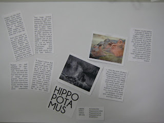
My initial design for my layout was something I was relatively happy with but I dont think it reflects the Hippopotamus well enough. The design is quite minimal and not particularly inventive in terms of the way I have used the type. 

  
After I printed this out I cut out all the elements of it and started to play around with them manually, exploring styles of David Carson I spoke about in my previous blog post on grids and layouts. 


These layouts were just being used from he original I made but I think I got some more interesting results from just playing round by hand, I drew up a few layouts on paper, some I kept in a quite standard format but then I started to experiment further and I found the results more fitting to the brief. 


I started the draw larger images of hippos in the thumbnails which I think really reflects the size and scale of the Hippopotamus. 

Wednesday, 3 July 2013

OUGD406 - Design is about doing - Secret 7"


The secret 7 brief was one of my favorite briefs we did all year, I liked it because it was a live brief with the possibility of actually winning something or having your work acknowledged, plus it was for a good cause. The idea behind it is you are given several music artists to choose from which were, Elton John, Haim, Public Enemy, Nick Drake, Nas, Laura Marling and Jessie Ware. From those artists they had one song each that you had to create a 7" vinyl sleeve for. 

The rules were that you couldn't inclue the artists name or track on the sleeve because the idea behind it was that people would come a buy the records without them knowing, purely choosing them on how they looked. 
After listening to the songs of each artist I decided to select Nas as the one I would design a sleeve for, I didn't particularly like the song but I felt there was a lot of potential ideas I could use from it being Nas.

Through my initial research I felt I wanted to go down the route of drawing Nas's tattoos as he has quite a few pretty interesting ones including one saying Gods son written across his chest. I also looked into his background as a rap artist, where he grew up and any significant moments in his life. I also looked at his past album and LP covers to gauge an idea of what sort of stuff fitted with his music.


In the end I decided to go along the route of his tattoos, specifically focusing on his Gods son tattoo.  I drew up a diagram representing all the things I knew about him that I thought I could use in my initial sketches.


I started by drawing out some thumbnails including the god son tattoo idea and the Queens bridge where he grew up as I thought these could possibly work.


I liked the Idea how he thought to some extent he was gods son considering he got it tattooed across his belly. I thought this showed to me an over inflated ego, in his time Nas has made loads of good songs and is a well respected rapper, as of late though his productions have been pretty off the mark. I thought  I could use this against him considering I didn't particularly like the track, so I wanted to take the piss out of him a little bit. I thought about the actual meaning of Gods son which is jesus and saw that I could use this to relate back to Nas considering also that he is a christian. 


These were some of my initial drawings before I started drawing jesus, I thought about maybe drawing Nas in a cartoon style.


His song I chose was called the godfather so I looked to the film for some inspiration and even thought about even incorporating the classic Godfather logo into my design. 

I eventually stuck with drawing jesus but initially I couldn't figure out what sort of style to draw it in, I tried a very loose style taking inspiration from some of David Shrigley's work. I tried several variations eventually going with a more biblical style I felt looked more how a depiction of Jesus should look.


I used different quality of lines to make the picture more interesting to the eye, I also added a little speech mark to add a little humour to the drawing. 


After I scanned the image in I could play about with it and see what colours worked best, I tried initially to overlay some colour behind it I felt it worked to an extent but didn't really have any relevance to it.  


I tried other block colours loosely following the idea of a stain glass window, I didn't particularly like the outcome as I felt the black was a bit to over powering, I tried the white back ground and white lines but I felt the image lost its impact. 


The final colour variation I tried was a more natural selection, I wanted to keep the black background because I didn't feel white worked very well.


I felt that the image looked its best at its simplest with just a black and white variation. This was the final image I ended up submitting. 
As this was a competition you have to submit your work online and people vote your image for a chance for your work to be displayed in the gallery. There is two different selection processes, the peoples choice and chosen by the competition. I got an email a few weeks after entering saying I was going to have my work displayed in the gallery which was a brilliant surprise. Sadly I couldn't go down to London to see the exhibition but I have seen images online.


Every winner of the competition gets a sleeve from the event this is the one they sent me.

OUGD404 - Birth of a font


The first step in this task was to identify all the individual parts that make up typography, this anatomy of the letters. Once each part of the letters were determined we cut the letters up to create lots of smaller pieces that could be interchanged between several different fonts we had selected, bold, gothic, script and serif.
During the session we were asked to make about 200 different variations of just upper case and lower case A and B's. I found the best way to work was systematically, so only changing one aspect of the altered letter form each time as there were literally thousands of possibilities.


Here are some of the outcomes of the altered letter, as you can see a lot of them dont work together with the swapped around parts, but the the second part of this task was to identify 5 letters that did work and develop them from that.


I first copied out the altered letter forms in pencil to get the shapes of the letter right, I then went over the pencil in a marker so when i scanned the image in the marker would show up so i could live trace it into Illustrator.


These are the final outcomes of the letters.