I created my original branding on illustrator based around some of the research I had been doing,


This was the first side of branding that I wanted to design because I had an idea for how the sushi restaurant would work, I wanted to propose an app dedicated to the restaurant where you could go in and choose food like any other normal restaurant, but you could also have the option of tying something new by going on the app and selecting something based on the meat it contained. The dishes would all be colour co-ordinated and although after you clicked on one of them it would take you to a page with some basic information on it would be getting you to interact with the app and to essentially try something new. I got the idea after watching an automated sushi restaurant on the news in japan.
I liked this idea basically because sushi is fast convenience food especially where it originated from in japan, its meant as something to have when your feeling a bit hungry and in a rush. The idea really stems from my original design of the menus, I wanted to create something that was a bit more creative than just ordering or selecting from a conveyer belt so my idea was to create a menu using thermochromatic paint where you would have a hundred dots laid out in a grid much like you see on the app. The idea behind it would be that you would be selecting on the basis you were willing to try something new and you would press the dots you wanted to try based on the content of the dish and you would hand it into the waiter then wait for your food.
I liked this idea because it tackle the problem of the menus being reused as the thermochromatic paint would after a few minutes return to its original colour so someone could select a different dish. A variation on this idea was that i make a similar looking menu but instead of heat changing paint I would use and overlay over the top of the menu where you could punch out perforated holes to select you dish.
After some thought I found there was really a fundamental floor with this way of ordering, it seemed unnecessary to have a waiter in a sushi restaurant and this idea of having to hand in your menus didnt seem right either. As part of this brief was that it had to be web based then I thought that a proposed app would be a really good idea, by ordering through the internet in-store it would be a cheaper and more efficient way of ordering individual dishes straight from the kitchen.
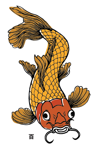
In the crit I presented some alternative design to the stuff that I had finished, among this was some illustrations I had done based around a coy carp, I got some good feed back from this and was told it was a direction that I should look into to make my brand stronger.

After going back to my already existing mock ups of the app I changed them to see what they would look like and I felt the overall effect was much more unique.

As print was to be the main focus of this brief I had to decide how I wanted to print, the options were limited at the time because the print room was fully booked up so my only other options at the time for digital print were hobs or staples. For some of the promotional work like poster and business cards I screen printed them mainly due to the individuality of each print but also due to the fact I could go to the print room everyday and get a relatively good amount of work done.


I split the screen down into 4 different colours which took a lot more time to make because I would have to wait for screens to dry every time I used a colour, this project was also delayed by people constantly stealing screens with my work on which would put progress back a day and not to mention would cost me more money. I happened on a number of occasions and there wasnt really anything I could do aside from to start again.
After choosing a solid branding I worked on the logo and the business cards, these things are the items I felt would need the most designing as other things like plates and uniforms can be altered to fit in with the branding of a restaurant.

This was a relatively early stage in my project but I wasn't entirely happy with the logo so I tried many different variations just to see which would fit the best.

I came up with a series of business cards, some that I really like some that I don't so much. I ended up using the fish as business cards just to try and keep a common theme running throughout the branding. I decided to screen print these as well which was probably more difficult due to the size of them.

I feel the the business cards turned out pretty well considering the amount of problems I had with the screen printing. Some of them turned out better than others as it was hard to register some of them being so small.


I had a laser cutting slot so I had a go at printing a business card on that, I felt with more time I could have made it much better but it turned out ok.


To explain y restaurant I thought it was important that I included interior plans and designs of the place because I had a very specific design in my head. I first started to mock up the designs on paper doing some simple pencil illustrations. Closer to the hand in i decided I should make some digital mock ups of the images by using the 3d tool on illustrator, I had never used this before but I felt it worked really well, you could change the perspective and angle of the grid to achieve some really dynamic images.


I did a mock up of the shop front and one of the interior adding little bits I designed from other parts of the project to give it some continuity. The second image demonstrates how the order system would work but one conveyer belt circulating a constant flow of dishes and the second belt delivering the food you would order off your phone or as suggested in my notes an inbuilt tablet into the table.
I needed to mock up some place arrangements for the restaurant to go with the whole idea of the branding, I couldn't get hold of any plates in time to attach some vinyl logos to it so I used photoshop to super impose some images onto them. originally I looked on the internet for japanese style plates and cups but there wasn't enough similar to create mock ups from so I ended up having to take my own at home.


I think my skills in photoshop are something that will need to be worked on so I can create more convincing pieces to display with my work.
Overall I was happy with some aspect of this project and un happy with other parts, I felt I should have done much more printing on uniforms and things like that and I also feel the research side of my project could have been more extensive, due to time constraints and problems like screen printing I feel I came up with a good starting point for a branding project.
No comments:
Post a Comment