I have chosen to brand Euro 2020 for a couple of reasons, the first is that it hasn't already been branded which is good because it gives you a completely blank canvas and there aren't any other factors that can really influence your design. The second reason is that it is a significant date as its the 60th anniversary of the competition. I feel when the date means something more it opens new ideas for things you can do within the branding.
Things to consider in branding -
Logo
Ball
Way finding
Official merchandise
Programmes/timetables - Lanyards
Football shirts - heritage vintage fro the 60th anniversary
3 teams football shirts special edition boots
These are just some considerations, ive kept the list small as well because its all about the small stuff with this project. There isnt a host country for the 60th anniversary, instead its being held in 13 different host cities around europe, with the final being held in wembely. With this comes its own challenges, for instance the logo needs to be adaptive and able to change for each country to remain relevant, but at the same time needs to mean something and show a connection between the 13 host nations.
This is the same for the way finding, I feel there needs to be a theme running through the whole thing but with something tailored to that individual country.
The 13 countries are -
Spain
Scotland
Romania
Irland
Netherlands
Hungary
Denmark
Belgium
Russia
Italy
Germany
Azerbaijan
England
The logo -
This is probably one of the most important aspects in this branding project so I have put a lot of time into it already. My initial idea was to use a variation of the first logo used for the competition to give it relevance in terms of the 60th anniversary.

This was the first logo used and then because of its popularity and success subsequently was used for the next 8 tournaments. I think it works well because of the easily changeable colour pallet which is used to represent the different countries it is held in. This was something that I want to incorporate into my logo. I want to experiment with this logo further because it could be a secondary logo that is just applicable to one certain country. If i re create this then it would show a strong affiliation to the first logo and the 60th anniversary.


The challenge I have with this logo is that it has to be relevant or representative for the whole of europe, as opposed to the logos that just have to represent a nation where they can take cues from flag colours or culture. I looked into representing all 13 nations with an individual colour, something taken from their flag but the results were too messy. The european flag was a starting point for a lot of my designs, I feel it is one of the best ways of visually connecting all the nations.


These were some initial ideas, I wanted to create a clean minimal logo but something that you could still see as an official logo. I started to play around with the classic ball design because it shows an affiliation with the original game in the 60s.
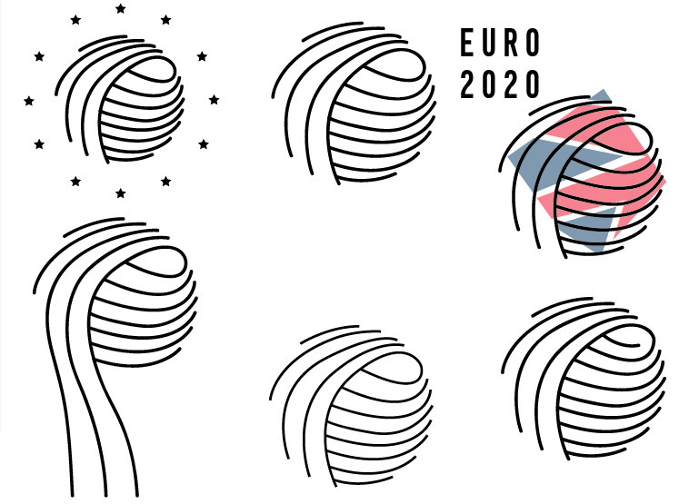
This then developed into something that represented the 13 nations hosting in the tournament by using lines for each nation. I tried to keep the ball representative of the original ones but with a modern more subtle twist. Under layered colour was another idea I started to explore to represent each individual country. I feel this logo can also represent a number of things, it could be interpreted as hands jointing together, this shows unity and respect something that is very relevant in football today. I also feel the logo bares some resemblance to a flower, something often used in football tournament logos. I like it because it works on several different levels.

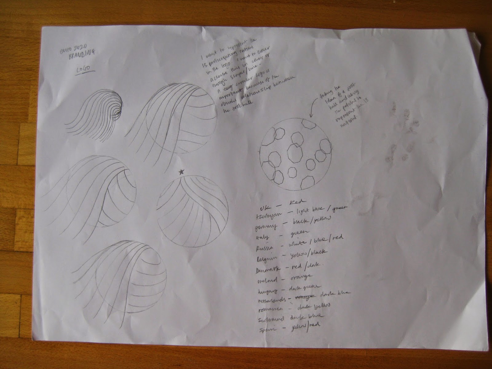
Separate to the other logos I started playing round with colours to represent each individual nation, the overall impact looks quite childish and i dont feel works very well. I used hexagons as an obvious relationship to footballs.

This was a second attempt where by I only used blue, a neutral colour and the main colour of the european union flag. The patches are also laid out in their geographical positions when looked at on a map.

No comments:
Post a Comment