As this publication is essentially a product I went about making a second sketchbook that just had blank pages in it. I bound it the same way and used the same colours I had used in the publication to tie the two books together. Thinking about it from a marketable perspective I think this adds value to the product as a whole, when I was traveling I found there were a lot of times when you had to keep yourself occupied, weather your waiting for a flight or on a 16 hour bus across the country. Bringing a sketch book is something you can take to fill your time.
In the publication pack I have included the publication itself, this has lined paper and plain paper in the back of the book, a sketch book this is bound and covered in the same way and a pencil which matches the colour theme of the two books.


This is the finished spread for the publication, Im happy with the look of the publication, I like the mix of different illustration styles I feel it gives the look of a travel guide that shows a more personal side of thailand, something that reflects my own personal experiences. I chose to only use one colour due to a couple of reasons -
1/
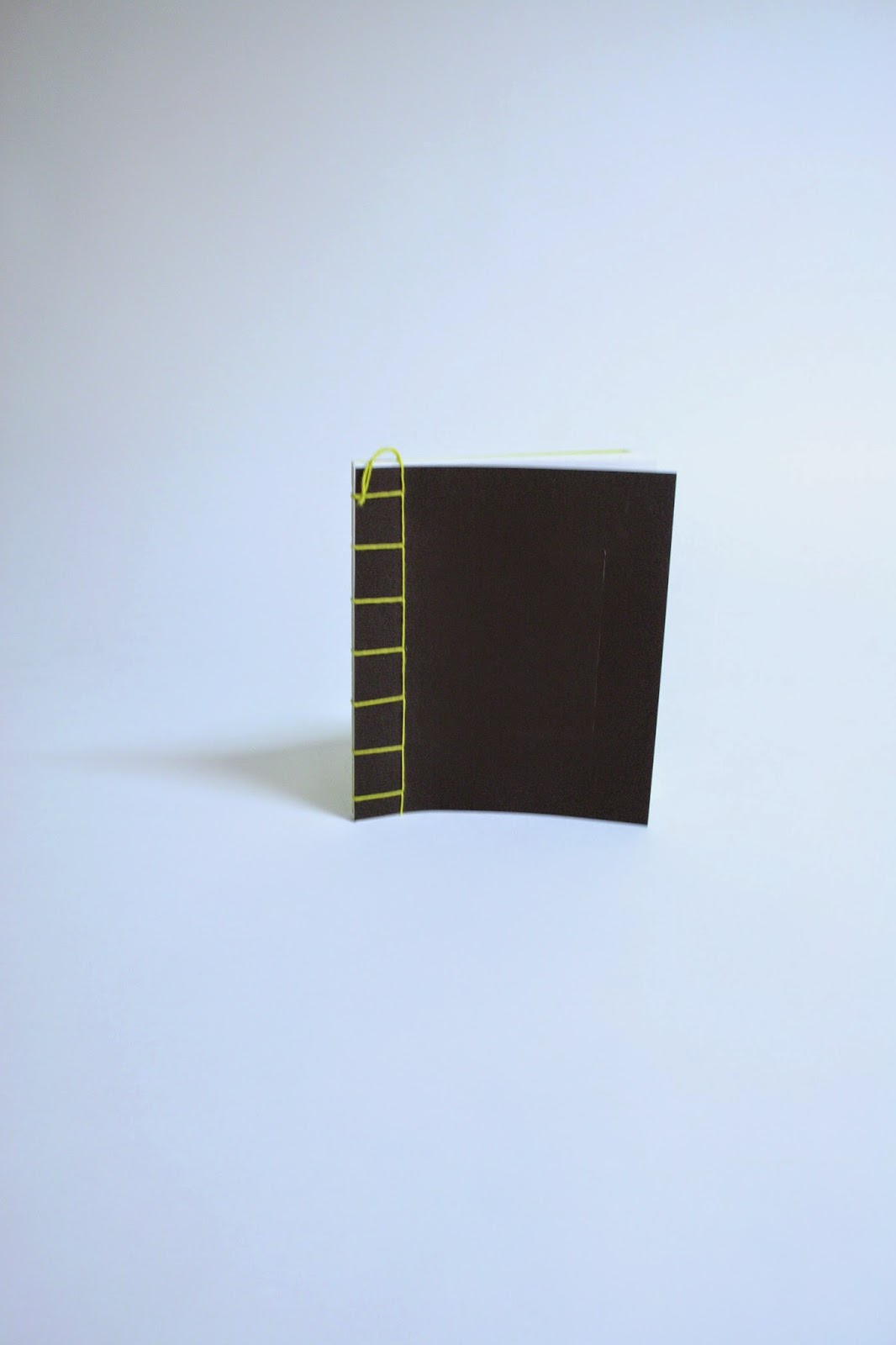
Cost of printing, this was designed to be a rough guide not something someone is going to pay lots of money for, its aimed at people around my age so the target audience is about 18-28. I personally wouldn't want to pay an excessive amount for a 15 page guide that could easily get lost or damaged. it rains a lot in thailand so its something you need to consider that a lot of your stuff with get wet at some point. I have added things too the book which should ensure it shouldn't get too badly damaged, the biding doesn't use any glue do if the book were to get wet the paper should hold together and also dry to a point where it would be usable again. I have added a cover to the front of the book which wraps around the publication which should protect the paper from any dirt and a small amount of rain.
2/
I wanted the publication to be in keeping with the sort of information it contains. The book is designed to be a travel journal as well as a guide so I wanted to include images that I had sketched while I was traveling around Thailand. Adding colour I thought might take away its rougher aesthetic and charm. Lots of the images are also inspired by the images you will often see on the walls of Buddhist temples, from the ones I saw many of them weren't coloured they were just line drawings much like my versions.
I chose yellow as the only colour I used because I felt it fitted well with the book. Yellow is a happy colour, its symbolic of the sun and is associated with joy, happiness and intellect. Its a colour thats a great communicator that loves to talk, its also apparently the colour of the networker and journalist. These are all things I wish to project through this journal.
Layout was a big part of this publication in the end, I have always liked good layout design but it was only until I looked into it further that I started to understand how to use it properly. A good layout will help the book flow better and work as a whole, this is something I am glad I worked on to improve because I am happy with how some of the pages have turned out. One thing I might have liked to experiment with more is the stick its printed on. Like I mentioned It rains a lot and it can often be quite sudden when it does. I originally wanted to print my first copy of this publication on fireproof paper which is very durable and waterproof. The paper has a waxy coating which stops it from tearing easily. Little details like this I believe would improve the publication but it would also raise the overall cost of the book so its about making realistic decisions and compromises.


These are some images of the final publication, Ive tried to keep the yellow and black theme running throughout the whole range. Ideally I need to print out a band to wrap around both books with some indication to which country it is a rough guide for.
This was another reason I used minimal colour because I feel its an easy formula to replicate when it comes down to making guide for other countries. I feel this is worth considering because if I had more time I would have made another guide in the same style, maybe with a change of colour to distinguish between the different countries.
No comments:
Post a Comment